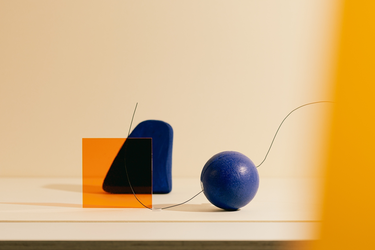
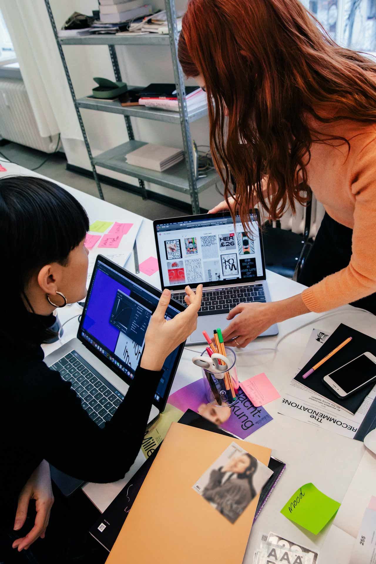
New year, new inspiration: the turn of the year always motivates us to get new input and rethink the familiar. If you feel the same way, here are two graphic design trends that are likely to play a major role in 2025 and can be creatively implemented in a variety of ways.
Utilitarian Design – Minimalist maximalism in the grid
Minimalist maximalism – what is that supposed to be? A legitimate question. But let’s start at the beginning. Utilitarian design combines functionality and pragmatic design. It may remind you of shipping and packaging labels or flight tickets. A large amount of content is arranged in a structured way. Utilitarian design therefore offers a great opportunity to accommodate a lot of information and different content in one design at the same time. However, the trend also focuses on pragmatism and functionality: the organized way in which the content is arranged ensures that the end result looks minimalist to a certain extent – even though there is a lot going on at the same time. Minimalist maximalism, in other words.
Features of the Utilitarian Design
Barcodes, logos and icons in geometric shapes
In addition to text, graphic elements such as logos, pictograms and barcodes play a key role. Embedded in circles, squares or rectangular boxes, they are a central stylistic device of utilitarian design. These elements often convey a clear message, but sometimes they only serve a purely aesthetic purpose. In any case, they serve to visually separate content and thus ensure clarity: functionality meets design.
Harmonious grid for organized maximalism
A strictly organized grid layout is the main feature of utilitarian design and forms the basis for the arrangement of all elements. The trend combines text blocks, numbers, symbols and lines. The grid ensures that a harmonious overall picture is created despite this abundance (and diversity) of content. The design retains a clear structure, as each area has its own fixed place. Although there is a lot going on at first glance, the design never appears chaotic and viewers can find their way around immediately.
Color palette: black and white plus accent color
The color scheme in Utilitarian is usually minimalist: Black, white and a single accent color usually dominate the design. Sometimes there is only one accent color on a white background. The minimalist choice of colors contributes to the clear and uncluttered structure of the design and gives the overall concept an industrial yet modern and fresh look. And yet the same applies here: Whatever has style is allowed.
Order meets chaos
The true mastery of Utilitarian Design is shown in the successful combination of clear, orderly grid arrangement and free, creative design. Together, these seemingly opposing elements create a tension that creates strong contrasts and produces visual experiences that are both functional and aesthetically pleasing.
A structured framework provides orientation and clarity, while creative freedom opens up the opportunity to break the rules and create moments of surprise. The result is a design that is both logical and lively – a balance that remains in the memory and appeals to the viewer again and again.
Possible applications of utilitarian design
We have been seeing utilitarian design in the streetwear sector for some time now, especially on T-shirts. But the creative use of grids can be applied to a wide variety of projects: Whether on posters, flyers, packaging or menus – utilitarian design offers the opportunity to present a wealth of information in a modern and clear way. And this graphic design trend can also be useful in corporate communications for presentations and the like.
Bento Grid System – structure inspired by the Japanese lunch box
Even though this graphic design trend is inspired by the Japanese lunch box “bento”, it is by no means only applicable to food and nutrition. In fact, the approach is similar to that of utilitarian design. However, while the latter is based on a strict grid system, the Bento Grid System brings more flexibility to the structure – without losing clarity.
Features of the Bento Grid System
The parent rectangle
The basis of the Bento Grid system is a large, superordinate rectangle, which forms the basis of the design. Smaller boxes are arranged in this rectangle to create an overall picture. Each box has its own boundaries. This enables a clear separation of the contents and their respective functions.
Variability and diversity in height and width
The smaller boxes in the layout vary in size and shape. Wide and flat, narrow and high, square and rectangular – anything goes. This allows us to present a wide variety of content – text, images or icons – harmoniously while maintaining a visual order.
Flexibility and individuality
The outer borders of the individual boxes allow more flexibility in the design: each box can be designed independently of the overall picture and can therefore stand alone if necessary. This allows a wide range of options in terms of color, shape and font – and the design remains consistent despite the variety.
Minimalist style
In order to avoid appearing overloaded with content, the Bento Grid System takes a rather minimalist approach to the design of the individual boxes. Colors, typography and images are used discreetly to make the content easy to consume and to emphasize the functionality.
Possible applications of the Bento Grid System
Just look at your own cell phone: the Bento Grid System is just crying out for app and web design. But this design can also be used in the form of social media posts, flyers, menus or posters to convey content such as text, images and graphics in a visually clear and compact way.
Similarities and differences between the two trends
Although Utilitarian Design and Bento Grid System follow similar principles – a clear organization of information – they differ in their basic structure and aesthetics.


Conclusion
Whether print products, websites or social networks: content and information always play a role. It’s not just about a pretty cover, but also about what’s behind it. With the graphic design trends Utilitarian Design and Bento Grid System, we won’t have to choose between appearance and content in 2025, but will be able to combine functionality and aesthetics with a system.